Everything is simple here: the Honda sign denotes a capital letter H, but, of course, in the original design. "Honda" is the surname of the company's founder, Soichiro Honda.
Honda's motto is "The Power of Dreams".
Subaru
Per Subaru name I must say special thanks to the president of Fuji Heavy Industries (on its basis, they began to create cars) Kenji Kita. " Japanese car- Japanese name! - the big boss pestered everyone and even announced a competition for the best name. And he came up with it himself: in Japanese, "Subaru" means "gather together", as well as the constellation Pleiades - part of Taurus. There are more than 200 stars in the Pleiades, but only six can be seen without a telescope. Keith thought this was symbolic - after all, his Fuji Heavy Industries was also formed thanks to the merger of six companies! And you and I received six luminaries on the emblem.
Infiniti
The Japanese see the symbol of Mount Fuji as the basis for the inscription of the logo, but in fact this emblem means a road going into the distance, to infinity, hinting at the limitless possibilities of a prestigious brand.
GAS
But Russian cars GAZ was originally copied by American Ford cars, and this also affected the emblem: the word GAZ in a similar oval and the font of the letter G was similar to Ford's branded F. Own logo - deer - was adopted in 1950. Why deer? Like many brands, GAZ took as a basis the coat of arms of the city in which the company was located, i.е. Nizhny Novgorod.
Dodge.
There are two main versions of the appearance of the emblem, and both of them are very reliable: the first is associated with the family coat of arms of the brothers John and Horace Dodge, or curved exhaust pipe first Dodge car resembled the twisted horns of a mountain sheep - unknown. But the fact is that the red head of a ram with twisted horns still identifies cars to this day. American company. There is also such a fact: the emblem with the image of a ram was once attached to Dodge trucks, but then was removed. Then the head of Chrysler corporation Lee Iacocca decided to revive it. And Canion & Erkhard resurrected the “ram theme” in the advertising slogan “The Dodge truck is assertive like a ram,” and the firm restored its image, both on the trucks themselves and in advertising publications.
Jaguar
Initially, Jaguar had the name Swallow Sidecar (swallow is translated from English as “swallow”), the company emblem depicted a flying swallow, but in 1935 the company decided to change the affectionate name to something more sonorous and aggressive. Also, the reason for the name change: after the Second World War, there was such a notion that the name Swallow Sidecar can be shortened to the meaningful SS - security forces of Nazi Germany, and this is simply not acceptable! More than 500 options were proposed, and they settled on the jaguar - naturally, due to the fact that this animal symbolizes speed, power, sophistication, grace and beauty. Curiously, the company was founded by Sir William Lyons, and "lyon" or "lyon" in most European languages means "lion".
Lambordghini
In the vicinity of the native village of Mr. Ferruccio Lamborghini, breeding bulls have been raised for a long time. Therefore, Ferrucho chose this animal as a symbol of mechanical power. Moreover, initially Lamborghini made rural tractors. The automobile division did not appear until 1963, and the bull looked great on the tractor hood.
Alfa Romeo
The emblem of Alfa Romeo is based on the idea of the coat of arms of Milan. It was invented in 1910 from the beginning of the foundation of the company and has changed slightly several times throughout the existence of the company.
The left side of the badge is the Red Cross on a white background, which recalls the heroic deeds of the Milanese Giovanni. In the battles to reclaim the Holy Land for Christianity, he was the first to place the Cross on the walls of Jerusalem.
The right half is the crest of Ottone Visconti (founder of the noble Visconti family of Milan). He is credited with killing an unbeliever in combat during the First Crusade. His shield was with the image of a snake devouring a man. Ottone used this emblem in his family crest, which was later adopted by the city of Milan. (The figure being eaten by the serpent is either a child or a Saracen, depending on who tells you about it.)
In 1915, Nicola Romeo took control of the A.L.F.A. and added his name to the composition of the emblem.
A laurel wreath was added to the badge in 1925, in honor of winning Alfa's first World Championship.
In 1972 Alpha opened the Alfasud factory in Naples and dropped the Milano name from the badge.
In 1981, the laurel leaves were also dropped.
Thus, the modern Alfa Romeo logo is closest to the original version of 1910, with the exception of minor changes. The history of changing the logo of the car company is shown in the figure below.
Cadillac
Although the Cadillac trademark was only registered in 1906, its emblem has been in use since September 1902. The emblem of Cadillac in those years flaunted a shield with merlettes tilted to the left, and a wreath of tulips enveloping a crown with seven teeth.
From 1916 to 1918, Cadillac used a badge that included a wreath of tulips borrowed from the previous version of the emblem, a nine-pronged crown. In 1920, the crown again became seven-pronged and joined the shield. This logo existed until 1925.
To make the badge more in tune with the clean style of the new Cadillacs, the designers used the same V-shaped element for the V8, V12, and V16 models, and added fenders to it. The new logo was invariably emblazoned on the radiators of all Cadillacs until 1935.
Post-war Cadillac models featured several newly designed logos based on the V-shaped element and the crown. The 1947 emblem is one of the first post-war emblems to include a "V" with a crown.
Beginning in 1956, there was a trend towards a reduction in height and expansion of the V-shaped element, and, as a result, the entire Cadillac emblem. The 1960 models had the widest emblem.
1963-1999
worldwide famous emblem Cadillac "wreath and crown" were obtained as a result of artistic processing of the coat of arms of Sir Antoine de la Mothe Cadillac (Sieur Antoine de la Mothe Cadillac), who founded Detroit in 1701.
2002
Inspired by European painter Piet Mondrian, one of the most important “geometrist” painters of the 20th century, this “symbol of excellence” has been stylized and simplified by designers to reflect Cadillac’s future design philosophy from a bold new angle.
ROLLS ROYCE
ROLLS-ROYCE The figure of the "flying lady" (it is called the "spirit of ecstasy" - spirit of ecstasy) was first installed on the hood of his own "Rolls-Royce" by the English Lord Montagu in memory of his deceased mistress. The statuette, commissioned by Frederick Henry Royce and Charles Stuart Rolls, was made by sculptor Charles Sykes. The public liked the idea, and since 1911, the “spirit of ecstasy” began to be put on all Rolls-Royces. Today, leaving the car in the parking lot, the owner of a British limousine can press a special button, and the "lady" will hide from thieves in the bowels of the hood.
Aston Martin
The first Aston Martin emblem appeared in 1920 and consisted of intertwined capital letters of the company name A and M.
The next version of the logo was designed in 1927. Then the famous wings of the company appeared, borrowed, by the way, from Bentley and designed to symbolize speed.
A year later, the wings were styled according to the fashion trends of the time.
In 1947, the name of the new owner, David Brown, was added to the logo, bringing with him a new era to Aston Martin. New car designs, new super motors from Lagonda, new Le Mans victories and a new name on the emblem - David Brown.
The company has changed hands many times over the past few decades. David Brown's name has disappeared from the logo. Modern car emblem is neutral: traditional fenders and Aston Martin name
Buick
From an early stage in its development, Buick used cursive variations of the word "Buick". In 1930, the logo was replaced with the coat of arms of the Scottish aristocratic Buik family. In 1960, three such coats of arms were already included in the emblem, which symbolized three different Buick models: LeSabre, Invicta and Electra. In 1975, the company changed the logo, changing it to "hawk". This was due to the launch of the new Skyhawk model line. However, in the late 80s, with the removal of the Skyhawk model, the logo was also changed - Buick returned to the "shields" again.
Maserati
Like Alfa Romeo cars, the Maserati symbol is a result of pride in their city - the trident is the traditional emblem of Bologna, where these cars were produced.
Maybach
Maybach logo: two different-sized Ms inscribed in a triangle with curved lines. Initially, the letters M were an abbreviation for Mybach Motorenbau, currently they mean Maybach Manufaktur
SAAB
The logo depicting a griffin, a mythical monster with the head and wings of an eagle and the body of a lion, passed to the company "inherited" from Vadis-Scania, a truck manufacturer that at one time merged with Saab. The griffin is depicted on the coat of arms of the province of Scania. In 2000, Saab Automobile was bought out by General Motors, and now has no connection with Saab Corporation, except for historical ones.
Chery
The Chery logo consists of 3 letters C - A - C ("CAC" is the English abbreviation for Chery Automobile Corporation). The letters "C" on both sides of the logo surround the letter "A", it looks like human hands, and stands for unity and strength. The company believes in the potential of its employees and attaches everyone to the main goal - the prosperity of the company. The two "C"s on either side of the logo give the entire emblem an elliptical shape that looks like the earth, symbolizing the company's sustainability and potential. Chery cars are designed primarily for people (each car has airbags in the basic version, as well as a large number of technological standard options: such as ABS / EBD car control systems, as well as high multimedia capabilities Chery machines with basic DVD and MP3 options).
Corvette
In 1927, General Motors hired designer Harley Earl, who brought style to the American auto industry. All the cars of the 50s were somehow created under his influence, exposing the soul of the American nation - young, ambitious, focused on results and quality. He loved sports cars, and admired such European models as the Jaguar (Great Britain), Alfa Romeo (Italy) and others. He convinced the company's management to start working on a sports car. American model, and the result was the 1953 Chevrolet Corvette. The first show took place at the Motorama Show of the same year in January, in New York at the Waldorf-Astoria Hotel. Originally for logo new car was supposed to use the American flag, but for ethical reasons was replaced with a waving flag that contains the Chevrolet logo (something like a cross) and fleur-de-lis (lily flower). When the designers turned to the history of the French family of Louis Chevrolet, one of the founders of the famous car company and gave it a name, they did not find anything in their heraldry that could serve as a logo for a new car. But they liked the idea of using the lily flower, which in French culture is a symbol of purity and peace. Thus, now the emblem looks like two crossed flags - one racing, in a black and yellow checkered cage, and the other, with the Chevrolet logo and a lily flower
Acura
The car's logo is a stylized "A" that appears to resemble metal tongs. Such an uncomplicated pattern is explained by the difficult conditions for registering new trademarks in the United States - each time there will be a similar trademark in the general list of logos.
DAEWOO
Daewoo (Daewoo, Daewoo Motor) is a South Korean automobile company that manufactures cars. Headquartered in Seoul, the capital South Korea. Owned by General Motors. The name means "Great Universe" in Korean.
The company was founded on March 22, 1967 by Kim Woon Jun under the name Daewoo Industrial. Until 1993, she collaborated with General Motors, and in 2002 the Americans bought the company. And the truck plant was bought by the Indian Tata Motors.
Lancia
Over the hundred years of its existence, Lancia has changed the shape and colors of its logo several times, while maintaining recognition and individuality.
1907. There is no logo as such. The grille of the first 12-horsepower car Lancia Alpha flaunts a calligraphic stroke of Lancia.
1911 Carlo Biscaretti di Ruffia paints the first real Lancia badge - a four-spoke steering wheel with an accelerator handle on the right serves as a background for a blue flag on a spear (lancia in Italian also means spear) in the center of which Lancia is displayed in gold letters in the corporate font. From this moment on, we can safely say that the automaker has its own unique logo, which is destined to be associated with the name Lancia.
1929 The same Carlo Biscaretti di Ruffia proposes to place the logo on a triangular shield.
1957 Lancia Flaminia first uses a new logo, more refined and stylized, but almost completely lost color. At the same time, the key elements of the logo are completely preserved - the shield, the steering wheel and the flag on the spear.
1974 The emblem undergoes significant changes, in particular, the steering wheel becomes four-spoke again, the shield is completely blue. This emblem is easy to mass-produce and in any size without sacrificing readability and recognition.
2000 Minor changes to the chrome dividing and border lines, aimed at giving some three-dimensionality to the whole image.
2007. A lot has already been written about this rebranding ... The flag disappears from the emblem and, as a result, the spear. Wheel becomes schematic, the word Lancia is written in the same original font.
Lincoln
The plant, named after the famous American President Abraham Lincoln, was founded in Detroit in 1920. Two years later, he became the property of the Ford company, which still owns it. Lincoln brand cars have gained popularity all over the world. So the current company logo - a stylized compass card with arrows pointing to the four cardinal points - seems quite logical.
Oldsmobile
This brand of cars has existed since 1896. Since 1909, the plant, founded by R.E. Olds, has merged with the General Motors Corporation. The emblem has been modified many times and by now it is the letter "O" with an abstract "symbol of swiftness" inscribed in it.
What do Aston Martin, Bentley and Chrysler have in common? Yes, all three companies produce beautiful and powerful cars, however, for different niches. But these brands are related by outstretched proud wings on the hoods of their cars ... And the feeling of flying faster than the wind ... Aston Matrin
Aston Martin, a manufacturer of sleek and fast sports cars, was originally a British brand. Since 1994, the AM brand has belonged to the American concern Ford, but was recently bought out by a group of investors promising a new dawn for the legendary brand. The company was founded in 1913 by Lionel Martin and Richard Bamford in Newport Pagnell. The first sport car partners was built in 1914. It was named Aston Martin - after Lionel's last name and after Aston Clinton Hill, where Martin won the local race in 1913. Aston Martin specialists honed their skills in races in which cars with a winged logo constantly participated.

 In 1947, the company was bought by David Brown, marking the beginning of the history of Aston Martin DB cars. In 1963, the legendary Aston Martin DB5 was released, becoming the most famous car of James Bond. Since then, Aston Martin has been the favorite brand of the famous British agent 007. Bentley
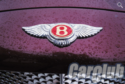 The letter B enclosed in wings is the logo of another company of the English queen. Aristocratic luxury - that's how you can characterize the chic executive limousines and Bentley coupes. This logo, according to Bentley Cars Ltd., is a symbol of independence, showing that Bentley is only Bentley and nothing else. Very… English, right? The brand was founded in 1919 by Walter Owen Bentley. Moreover, from the very beginning, Bentley focused on the production of prestigious cars. Even the first Bentley car was equipped with a 3.0-liter engine, which made it inaccessible to ordinary motorists. Like Aston Martin, Bentley cars often won races. In the early 1930s the company came under the control of another British concern - Rolls-Royce. Since then, Bentley and Rolls-Royce cars have been structurally similar in many ways. Only now Bentley was intended for those who do not want to sit quietly on an honorary back seat but wants to drive a car. One of Bentley's most famous cars is the Continental, a high-speed serial sedan that appeared in 1952. If, following Aston, we continue the theme of famous cars, then we will recall the Bentley S-2 model. It was purchased by John Lennon specifically for the presentation of the Beatles album - Yellow Submarine.


 The emblem itself is said to be designed by Autocar magazine artist Gordon Crosby. The letter B was first depicted in a crown of laurel leaves on a black background, and after 1931 on green. Ever since the foundation of the brand, the color of the winged B has been important. Red is assigned to sophisticated models, green - racing, and black - the most powerful and aggressive. At the moment, there are only two “black” ones - a coupe Bentley Continental T and the four-door Bentley Arnage T. By the way, the British have a pun on this score: the indispensable companions of a gentleman are Black T (black tee - Bentley) and black tea (black tee - black tea).
![]() But Chrysler, it seems, may soon drop out of the "winged" club, and of its own free will. The fact is that initially the emblem of the American brand was a pentagonal star. The company itself was founded in 1923 by Walter Percy Chrysler. But in 1998 the company joined German concern Daimler AG, forming the largest DaimlerChrysler enterprise. Apparently in order to avoid confusion with the three-pointed star of Mercedes-Benz cars, the five-pointed star went into oblivion and was replaced by open wings. But everything is back to square one. In May 2007, the Chrysler division was sold, and a decision has now been made to return to the five-pointed star. Well, let's hope that the return to the roots marks a new stage in the history of the brand.
But Chrysler, it seems, may soon drop out of the "winged" club, and of its own free will. The fact is that initially the emblem of the American brand was a pentagonal star. The company itself was founded in 1923 by Walter Percy Chrysler. But in 1998 the company joined German concern Daimler AG, forming the largest DaimlerChrysler enterprise. Apparently in order to avoid confusion with the three-pointed star of Mercedes-Benz cars, the five-pointed star went into oblivion and was replaced by open wings. But everything is back to square one. In May 2007, the Chrysler division was sold, and a decision has now been made to return to the five-pointed star. Well, let's hope that the return to the roots marks a new stage in the history of the brand.
Each machine has its own logo ( emblem) and each has its own story.
Define brand cars you can by the icon and today we will talk about the meaning of the logos of different cars.
Rolls Royc
Figurine of a winged woman - "Spirit of ecstasy".
The history of creation has a hint of romance. Once upon a time, the sculptor Charles Sykes was commissioned by his friend, a motorsport enthusiast, Lord Montagu to decorate his car with a figurine. Sykes created an elegant figurine depicting a woman in flowing clothes, creating the illusion of flight - a kind of nod to Lord Montagu's affair with his secretary. This figure drew the attention of Charles Rolls and Henry Royce. They also decided to order a figurine from Sykes, which could become a standard for decorating all cars of the brand.
Since 1911, Rolls-Royce cars have had a figurine in the form of a “flying girl”, which was officially recognized as a symbol of Rolls-Royce only in 1921 and was included in the price of the car.
Š KODA
![]()
The emblem acquired its modern look at Pilsen Skoda: it was there that features were born that, with minimal cosmetic changes, have survived to this day. In 1923, two official versions of the Skoda logo appeared. The first badge was in use for only two years, until 1925. This is an arrow with five feathers and the name of the brand, framed in a circle. The second sign has survived to this day: an arrow with three feathers.
Legends about the meaning and origin of this arrow-shaped logo are very different, and none of them has been officially confirmed. As they say, the author of the idea is the commercial director of Pilsen Skoda Maglich, who meant the sign in the form of an image of either the head of an Indian in a hat with feathers, or a rooster. According to a number of documents, the emblem was the product of a competition held under the supervision of the technical director of Pilsen Skoda, but the name of the designer has not survived to this day. The Skoda company is developing dynamically, and this dynamics will inevitably pass to its mark. In 1994, the Skoda logo debuted in a stylish new color scheme.
The meaning of the Skoda logo
What does the Skoda logo mean? The most reliable answer to this question can be obtained in the brand's brand museum in the Czech town native to the car: a large ring framing the emblem symbolizes the impeccability of production; the wing, which some perceive as a gear, means the manufacturability and innovativeness of products, as well as its prevalence throughout the world; an arrow, or beak, emphasizes the high quality of cars and the direction of production in the future; a small circle (eye) emphasizes the accuracy and consistency of all production processes.
Toyota
 The first and most common…
The Toyota emblem symbolizes a thread through the eye of a needle. The fact is that Japanese company Toyota Automatic Loom Works produced weaving machines until 1933. A little later, the company switched to the production of cars and the Japanese, as people who respect traditions, did not do anything to change the sign. Japanese manufacturer betrayed the logo also poetic - philosophical meaning. Namely: two intersecting ellipses symbolize the heart of the car and the driver, and the large ellipse uniting them speaks of the prospects and opportunities of the corporation.
There is another version...
The Toyoda company is named after its leader Kiichiro Toyoda and was engaged in the production of looms. In 1935, the company switched to the production of automobiles and was renamed Toyota Motor Corporation, for several reasons for the renaming:
Convenient pronunciation;
the word Toyota, spelled in Japanese, consists of eight strokes, and according to the founders of the company was attractive, because the number 8 in Japan is considered lucky and lucky.
Subaru
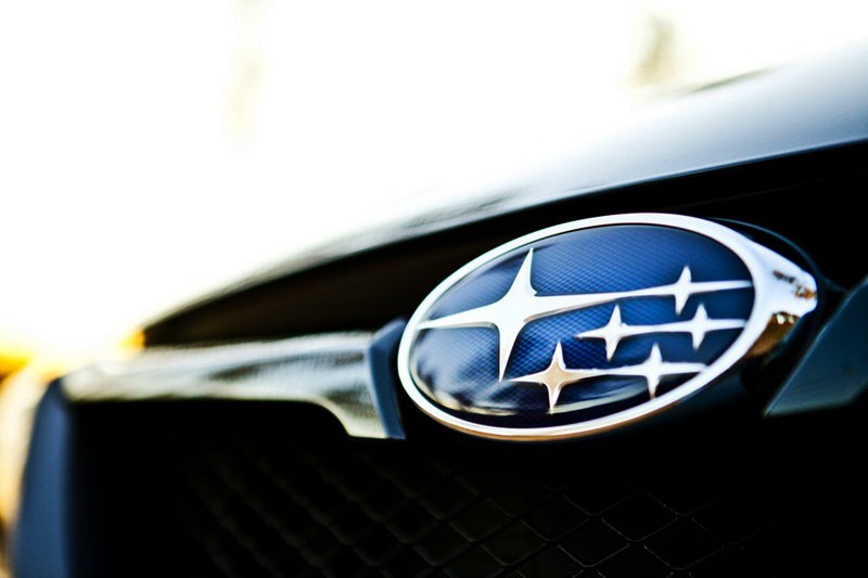 Subaru was the first Japanese automobile company who used the name from their native language.
The name of the company was given by Kenji Kita, president of Fuji Heavy Industries Corporation, in 1954.
The company's name refers to a constellation of six stars, also known by its original Japanese name, mutsuraboshi, in the constellation of Taurus. We know it as the constellation Pleiades. Since Fuji Heavy Industries was formed by the merger of six companies, the Subaru name is intended to symbolize this.
Subaru also translates from Japanese as "unite".
Mercedes-Benz
 According to the most common and convincing version, the Mercedes company with a characteristic symbol arose as a result of the merger of two manufacturers - Benz and Daimler. It happened back in 1926, and a three-beam star appeared, surrounded first by a laurel wreath, and later in 1937 by a circle. The new Daimler-Benz venture brought the achievements of both companies to Mercedes vehicles with great success.
The Mercedes-Benz logo, perhaps, is a symbol of the company's confidence in its perfection. The three-pointed star symbolizes the superiority of the company in all areas - on land, in the air, in water.
BMW
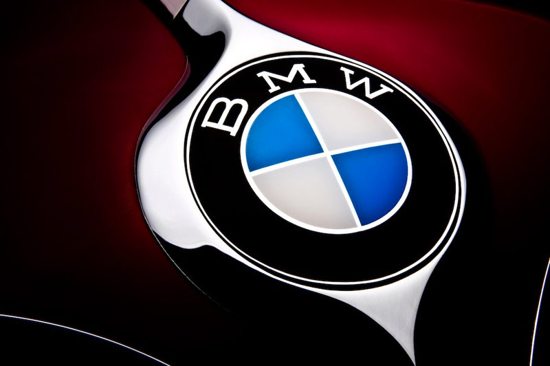 BMW's history began with aviation, and the company's logo remains true to its roots. The blue triangles of the BMW logo symbolize the aircraft's propellers in motion, while the white triangles represent the sky peeking out from behind them. In fact, the company played an important role in the Second World War, as it was one of the main suppliers of aircraft engines for German aircraft.
The current BMW logo design is said to have originated from the circular design of an airplane's spinning propeller. The white and blue checker boxes are supposed to be a stylized representation of a white/silver propeller blade rotating against a clear blue sky. The theory is further reinforced with the claim that the image originates in World War I, in which the Bavarian Luftwaffe flew aircraft painted in blue and white. It also reflects BMW's origins as a manufacturer of military aircraft engines during World War I, that BMW began as an aircraft engine manufacturer. According to the company's magazine, "BMW Werkzeitschrift" (1942), the BMW logo appeared when a BMW engineer was testing the company's first 320 engines. He marveled at the reflection of the bright disk of the spinning propeller, which looked like the aura of two silver cones.
And udi
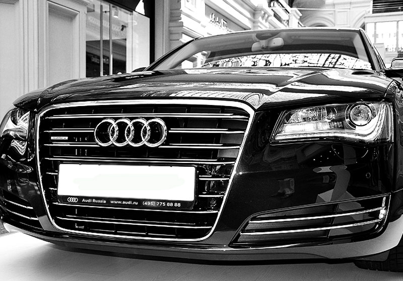 "Audi" has an extremely difficult fate. The founder of the company, August Horch, back in 1899 called his first business A. Horch & Cie (Horch is translated from German as "listen"). However, after ten years, August survived from his own company and he was forced to found a new one. At first, he used the old name, Horch, but the former partners took this brand from him through the court.
At first glance, the Audi logo is simple and straightforward, right? But not everything is as simple as it seems. Each of the four rings symbolizes one of the four founding companies of Audi in 1932: DKW, Horch, Wanderer and Audi.
volkswagen
 The 'V' in the company's logo is an abbreviation for "volks", which means "the people" in German. ‘W’ is short for “wagen”, which means car in German. That is, the company wanted to show that their car is a car for the people.
The logo was designed by Franz Xavier Reimspiess, a Porsche employee (the man who improved the engine for the Beetle in the 1930s), and was selected after an open competition. The letters "W" and "V" are combined into a monogram. During Nazi Germany, the emblem was stylized as a swastika. After the plant came into British possession, the logo was inverted, and later the background changed from black to blue. His work was considered the best in the logo competition for VW. Franz was even awarded by paying him a bonus of 100 Reichsmarks (about $400).
Porsche
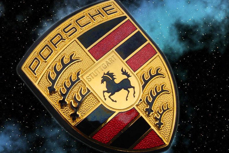 Porsche is named after the German designer Dr. Ferdinand Porsche, who was the author of many inventions and innovations: in particular, back in 1897 he created a car that uses solar energy, and in the mid-1930s he created the Volkswagen project, cars, which eventually became the most widespread in the world. Although Porsche had founded his own design firm as early as 1931, it wasn't until 1948 that his son Ferry began to assign the name to cars under development. Their production began in 1950. The rearing horse on the company emblem is borrowed from the coat of arms of the city of Stuttgart, which was founded in the Middle Ages on the site of a stud farm (at the beginning the name was Stuten Garden, “Mare's Garden”): the horns, red and black stripes are borrowed from the coat of arms of the Kingdom of Württemberg, whose capital was Stuttgart. This "combined" crest appeared as a Porsche emblem in 1952.
Peugeot
 Peugeot was founded in 1812 when brothers Jean-Pierre and Jean-Frédéric Peugeot converted their "windmill into a steel mill". Their first products were cylindrical rods for watch movements. Later, the Peugeot plant turned into a real family business. Over many decades, they produced a variety of goods: metal parts, machine tools, umbrellas, irons, Sewing machines, spoked wheels, and subsequently bicycles. Yes, indeed, it can be said that Peugeot's entry into automotive industry It started with bicycles. In the days of bicycles, Peugeot was considered the best bike manufacturer. In 1898, Armand Peugeot began production steam cars, and a year later (having met Daimler) switched to gas engines internal combustion. The lion on the Peugeot logo was copied by jeweler Justin Blazer from the coat of arms of France in 1847. At the beginning, the logo was used as a sign of the quality of the steel produced, but later, acquiring various forms (but keeping the concept), it smoothly switched to cars.
![]()
The first time the Emile lion figurine in Peugeot was registered on November 20 in 1850.
Emile Peugeot and Jules Peugeot - the founders of the company, the fathers of the Peugeot Frères company, they made an offer to the jeweler and part-time engraver from the deep province of Franche-Comte Julien Belezer to draw the logo of their new company, which will hallmark Peugeot products from competitors.
Oh pel
 Known German firm, founded in 1899, produced bicycles, motorcycles, cars and trucks. Since 1928, its factories have become the property of the American corporation General Motors. In addition to Germany, cars are produced in Belgium, Spain, Poland, Portugal. The logo of the company changed frequently, but in the end the logo was adopted in the form of the letter "O", crossed out by a zigzag of lightning. This is a tribute to the successful truck"Blitz" ("Lightning"), the release of which lasted about 30 years.
Maserati
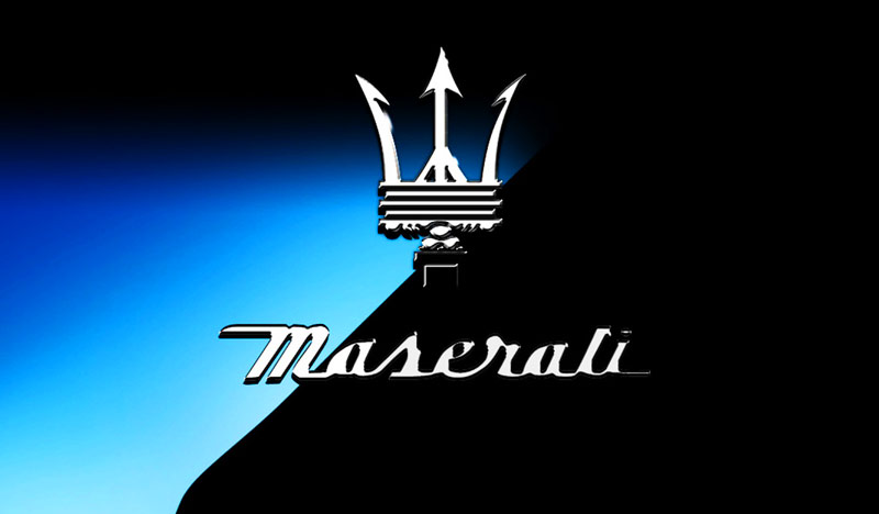 On December 14, 1914, Alfieri Maserati founded Officine Alfieri Maserati in Bologna. As the basis for the Maserati logo, Mario Maserati (Alfieri and Mario are brothers) took the image of the trident of Neptune, whose sculpture is located in the town square in Bologna.
But if the image of the trident was taken from a sculpture, then the idea itself has a completely different origin.
History of the logo
Once in the Bologna forest, a wolf attacked Alfieri Maserati with obvious unfriendly intentions. But then a man with a pitchfork in his hands arrived in time to help Alfieri. Thanks to the pitchfork and courage of the man, the wolf was defeated, and Alfieri was saved. The rescuer, in gratitude, became a driver in the Maserati team. And the image of the saving pitchfork was decided to appear on the car logo.