At the beginning of its history, in the 1900s, Toyota had nothing to do with cars and was called differently - "Toyoda" (Toyoda Automatic Loom Works), after the name of its founder, Japanese Kiichiro Toyoda, who produced automatic looms. The company logo depicted the name "TOYODA" in roman-ji, that is, the Japanese word in Latin letters, which at that time was quite bold.
Kiichiro began working on cars in 1933, and in 1937 the first logo appeared, for which a competition was created and more than twenty thousand options were considered. The victory was won by the emblem, which depicted the name "Toyota" in the Japanese katakana syllabary - "トヨタ". It was believed that such writing gives a sense of speed to the logo.
The letter "d" in the company name has changed to "t" and there are several reasons for this. First, from an aesthetic point of view, “Toyota” was easier to pronounce and looked prettier. Secondly, in this way, Kiichiro's business "separated" from family life. Thirdly, and this is considered the main reason, the letter was changed so that the number of strokes for writing a word in katakana was eight. That is, it should have been "da - ダ", with two strokes above the syllable "ta - タ", which were removed. Numerology for the Japanese is very important, and 8 is a lucky number that brings good luck and brings prosperity, which happened to the company.
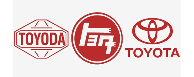
When Toyota cars began to be sold to other countries, there was a need for a new logo, which appeared in 1989. They say that the logo looks like a cowboy in a big hat, others believe that it is a needle with a thread threaded through the eye or two woven knitted loops as a tribute to the memory of the first manufactured product, but in fact, according to the official version, the Toyota logo is these are three ellipses (ovals). The smallest of them (in the center) symbolizes the heart of the client, the horizontal one symbolizes the “heart of the company”. Intersecting, the ovals form the letter "T" - the capital letter of the brand name. The largest ellipse symbolizes unification, the development of technology, and innovation in production.
In the logo itself, at the intersection of the ovals, you can also see the full name of the company, all letters are T, O, Y, O, T, A.

In 2004, the emblem was modernized, making it more voluminous, the red color was changed to metallic to match the one depicted directly on the hood of the car.
In 2005, after the release of the new Toyota AYGO model, the proportions of the logo were slightly changed and the color was made deeper.
It is known that the emblem assigned to the company not only provides the organization with recognition, but also expresses the concept of doing business, reflects the mission and role of the company in the market, its philosophical views and prospects. The emblem should convey to the consumer important information. Be recognizable, eventually.
Unofficial versions say that this emblem of the Toyota group of companies is a stylized image of a weaving loop, but you can find an opinion that this is a type of sewing needle with a thread threaded through the eye. Representatives of the company do not comment on such versions, believing that the Toyota logo and brand mean nothing more than moving forward and transitioning. This version, which, by the way, does not fit well with a visual image, is based on the history of the company. After all, from the family Toyota business rose to a company that would later become known to the whole world.
Talking about the visual expression of the idea of the company, you need to understand that we are talking about the Eastern culture of fine art and the tradition of writing. You can not measure the emblem of Toyota by European standards.
history of the company
Until 1936, the company was called Toyoda Automatic Loom Works Ltd, which was engaged in the production of advanced electronics for those times. However, the development of business and changes in the product line required a change in both the name and the concept of the company's presentation.
Production has started cars, and it was necessary to create a new trademark for this. Marketers were tasked with creating a memorable logo for the company and the cars produced by it. The management decided to organize a competition for the best logo to promote the brand, the main requirement of which was that the design should reflect a sense of speed.
The result of this competition also changed the name of the company, the word Toyota was considered more acceptable for writing in Japanese. The Japanese are also very superstitious, and it takes exactly eight strokes to write this word - in Japan, this number is considered a symbol of good luck and brings prosperity.
The modern meaning of the company symbol
Now this logo is rather a symbol of the company, because in its original form it is not used on products. But the corporation uses it as an emblem, and badges with the logo image are issued to all employees.
In the modern version, the logo consists of the Latin name of the company and three ovals, two of which symbolize trust between consumers and the manufacturing company. The logo uses two colors - white and red.
Also, if you look closely, the emblem resembles the letter T, which is the first in the name of the corporation (Toyota).
Something more is hidden in simplicity, free places in the emblem mean its global expansion and high potential.
It is believed that the Toyota logo has a great philosophical meaning and conveys to the consumer the idea of progress and overall positive development.
Bi-2 is one of the most successful Russian bands of the 2000s. She owes her appearance to two young people from Belarus - Shura and Leva (real names - Alexander Uman and Yegor Bortnik).
From the history of the Bi-2 group
Shura and Leva met in 1985 in Minsk, where both studied at the Rond theater studio. A common passion for music also contributed to the emergence of friendship. Shura studied at that time at a music school, and Leva wrote good texts. In August 1988, Shura, together with other musicians, creates his first rock band. Initially, it was called "Brothers in Arms", and was later renamed the "Shore of Truth". The group consisted of 15 people, but its composition was not stable. At an early stage in the history of the group, neither Shura nor Leva dared to act as vocalists. Shura played the bass guitar, and Leva, as before, wrote the lyrics.After a not too successful performance at a rock festival in Bobruisk, the group temporarily broke up, but already in August 1989 a new group appeared, called Bi-2 - abbreviated "Coast of Truth - 2". Shura and Leva became the vocalists of the updated group. By the way, it was on their initiative that the Bobruisk rock club was created. Soon, in the home studios of Minsk, the group recorded their first album, Traitors to the Motherland, which, however, was never released.
In 1991, Shura, and a year later, Leva, moved to Israel. There they continue to perform, and even take first place at a rock festival in Jerusalem. Their joint creative activity continued in Australia, where Shura moved to relatives (although Leva joined him only 5 years later). It was there, in Melbourne, that the friends managed to record the full-fledged debut album of the Bi-2 group.
On the crest of success
Soon the guys learned that their songs were actively played on the air of Russian radio stations, and in 1999 they arrived in Moscow. Their fate was changed by the song "No one writes to the Colonel." The fact is that she attracted the attention of Alexei Balabanov, who made her the main musical theme of the film "Brother-2". Thanks to the success of the film, the song immediately became a hit, and Bi-2 literally woke up famous. The second big hit of the group is the song "Silver", recorded with the accompaniment of a string quartet.In the future, the guys actively collaborate and record new compositions with such popular groups and performers as Splin, Chaif, Brainstorm, Yulia Chmcherina and Diana Arbenina. Their albums "Meow Kiss Me" (2001) and "Foreign Cars" (2004) diverge in huge circulation. In 2007, the Bi-2 group received the prestigious MTV Russia Music Awards in the category "Best Rock Project of the Year". Today, the popular group Bi-2 continues active concert activity and work on new albums.
The dystopian genre always implies a high level of meaning. The works of Soviet authors in the 1920s often dealt with the problems of the country. The philosophical meaning of E. Zamyatin's "We" can be explained from several positions.

Reflection of an era
Zamyatin's book "We" tells about the state of the future, in which everyone is equal. In this one can see an allegory of Soviet society. Evgeny Zamyatin wrote his work in the 20s, the era of revolutions and changes. Totalitarianism is expressed directly in his book. The very name "We" speaks of the community of the people. But equality is viewed from a negative point of view. The country of the Integrals is distinguished by its desire for identity. There are no personalities here, only one out of millions. People get up at the same time, go to work in the same order, pick up a spoon at the same time. Sexual life is strictly regulated. Each person who is assigned a number has the right to copulate with any woman. For this, a special ticket is issued. The most prestigious profession is mathematician. Creativity and fantasy are not in honor here. In this one can feel the assessment of the approaching repressions in the USSR.
The philosophical meaning of "We" by E. Zamyatin consists in assessing the apparatus of power through the prism of dystopia. The selection of people according to the story occurred through the improvement of food. To solve the problem of hunger, the government synthesized food from oil. Not everyone was able to adapt to it, so only 0.2% of all mankind survived. But they began to be considered the best of the best. The Benefactor, a reflection of the pinnacle of power structures, began to command them. Any rebellion or dissatisfaction with the system was punishable by public execution.
In order to bring up the appropriate generation, children were almost immediately taken away from their parents. They were brought up on the canons of the New World by strangers who programmed a single mindset. Society is more like a sect that firmly believes in the idea of government. In their mechanized life, they see no flaws.
Confrontation
The conflict of the story lies in the opposition to the Integral of the old world. The government has protected its society from wildlife with a wall beyond which it is forbidden to go out. But there were daredevils who broke the rules. This was the storyteller's friend, a simple mathematician, called I. She unraveled the imperfection of the Integral and decided, with the help of her associates, to carry out a coup. This is the opposite of utopia. The philosophical meaning of Zamyatin's book lies in the personification of the creative intelligentsia Soviet Union, enclosed in the fetters of totalitarianism. People are gradually becoming freer, they begin to publish previously banned works, but they are still condemned by the authorities. Evgeny Zamyatin demonstrated an attempt to free himself from this in his story. The intelligentsia is represented here by rebel I. The narrator, who is in love with her, tries to look at the realities of life with different eyes, but at the last moment he is afraid and retreats. The operation to remove the Imagination begins en masse. By this, Zamyatin expresses the zombification of society by ideology and the lack of information.
Sources:
- On the Meaning of "We"
The history of the creation of the Toyota emblem
The history of the company's logo is described in the book "Toyota: The History of the First 50 Years". Company founder Kiichiro Toyoda has launched a competition for the best proposal for a new brand icon. There were more than 20,000 entries. The winning entry consisted of katakana letters in a design that conveyed a sense of speed. "Toyoda" became "Toyota" because it was more aesthetically pleasing in terms of design and because the number of strokes needed to write was eight. And eight in Japan is a lucky number, foreshadowing ever-increasing prosperity. The font hasn't changed since then.
The Toyota emblem was created in October 1989. It consists of three ovals: two perpendicular ovals in the center symbolize the strong relationship between the customer and Toyota. The combination of these ovals symbolizes the letter "T" - the first letter in the word "Toyota". The backdrop space encapsulates the idea of the global expansion of Toyota technology and its limitless future potential.
In 2004, the trademark was modernized and became voluminous. The purpose of the changes was to express the main promise - excellent quality. The emblem is a three-dimensional image, made in metallic silver, and resembles the emblem that is attached to Toyota cars. The logo is made in "Toyota Red" color to emphasize the belonging of this color to the Toyota brand.
In 2005, after the appearance of a new emblem on Toyota vehicles AYGO trademark of Toyota has been changed accordingly. The proportions of the emblem have been slightly changed, and the color has gained more depth.
There is a version that the Toyota emblem is nothing more than a thread threaded into a needle - a tribute to the weaving past of the company. The fact is that Mr. Kiichiro Toyoda in 1935 created the first car in the company of his father, who was engaged in weaving. True, two years before that, an automobile department was opened in the company, where he pored over the design of Kiichiro's car. But the company itself interprets its symbol in a slightly different way.
The Japanese have a soft spot for crazy badges. The current Toyota symbol looks like a cowboy with a big hat, but it's actually three ellipses. The Toyota logo is not immediately identifiable. The Japanese have invested in the emblem of the car a far-reaching idea of the development of their production. Let's take a closer look. The smaller ellipse is the client's heart. Well, did any of the manufacturers depict customers on their logos? It seems not, so we should be pleased. The next ellipse is already the heart of the proposed product. And the biggest oval that unites is just the idea of technology development, great opportunities and new horizons.
Some logos famous brands carry hidden messages. The TOYOTA logo design also contains the name car brand. The letters T, O, Y, O, T, A are within the TOYOTA emblem.
Look at the picture before the text
WHAT DOES THE TOYOTA ICON MEAN -----
Toyota is widely known all over the world, many are familiar with its simple and at the same time such an original logo. But in addition to individuality and a memorable look, it, like any other logo, has a meaning and hides interesting and important information about the company and its history.
It is known that the emblem assigned to the company not only provides the organization with recognition, but also expresses the concept of doing business, reflects the mission and role of the company in the market, its philosophical views and prospects. The emblem should convey important information to the consumer. Be recognizable, eventually.
Unofficial versions say that this emblem of the Toyota group of companies is a stylized image of a weaving loop, but you can find an opinion that this is a type of sewing needle with a thread threaded through the eye. Representatives of the company do not comment on such versions, believing that the Toyota logo and brand mean nothing more than moving forward and transitioning. This version, which, by the way, does not fit well with a visual image, is based on the history of the company. After all, from a family business, Toyota has risen to a company that will later become known to the whole world.
Now this logo is rather a symbol of the company, because in its original form it is not used on products. But the corporation uses it as an emblem, and badges with the logo image are issued to all employees.
In the modern version, the logo consists of the Latin name of the company and three ovals, two of which symbolize trust between consumers and the manufacturing company. The logo uses two colors - white and red.
Also, if you look closely, the emblem resembles the letter T, which is the first in the name of the corporation (Toyota).

The history of the company's logo is described in the book "Toyota: The History of the First 50 Years". Company founder Kiichiro Toyoda has launched a competition for the best proposal for a new brand icon. There were more than 20,000 entries. The winning entry consisted of katakana letters in a design that conveyed a sense of speed. "Toyoda" became "Toyota" because it was more aesthetically pleasing in terms of design and because the number of strokes needed to write was eight. And eight in Japan is a lucky number, foreshadowing ever-increasing prosperity. The font hasn't changed since then.
The Toyota emblem was created in October 1989. It consists of three ovals: two perpendicular ovals in the center symbolize the strong relationship between the customer and Toyota. The combination of these ovals symbolizes the letter "T" - the first letter in the word "Toyota". The backdrop space encapsulates the idea of the global expansion of Toyota technology and its limitless future potential.
In 2004, the trademark was modernized and became voluminous. The purpose of the changes was to express the main promise - excellent quality. The emblem is a three-dimensional image, made in metallic silver, and resembles the emblem that is attached to Toyota cars. The logo is made in "Toyota Red" color to emphasize the belonging of this color to the Toyota brand.
In 2005, after the appearance of a new emblem on Toyota AYGO cars, the Toyota trademark underwent corresponding changes. The proportions of the emblem have been slightly changed, and the color has gained more depth.
There is a version that the Toyota emblem is nothing more than a thread threaded into a needle - a tribute to the weaving past of the company. The fact is that Mr. Kiichiro Toyoda in 1935 created the first car in the company of his father, who was engaged in weaving. True, two years before that, an automobile department was opened in the company, where he pored over the design of Kiichiro's car. But the company itself interprets its symbol in a slightly different way.
The Japanese have a soft spot for crazy badges. The current Toyota symbol looks like a cowboy with a big hat, but it's actually three ellipses. The Toyota logo is not immediately identifiable. The Japanese have invested in the emblem of the car a far-reaching idea of the development of their production. Let's take a closer look. The smaller ellipse is the client's heart. Well, did any of the manufacturers depict customers on their logos? It seems not, so we should be pleased. The next ellipse is already the heart of the proposed product. And the biggest oval that unites is just the idea of technology development, great opportunities and new horizons.
Some famous brand logos carry hidden messages. The TOYOTA logo design also contains the name of the automobile brand. The letters T, O , Y , O, T, A are within the TOYOTA emblem.

The first serial passenger car model - Toyota AA, which grew out of the A1 prototype, was not in demand at all. The car was a copy of the American Chrysler/De Soto Airflow. (1936)

The history of the creation of the Toyota emblem
The history of the company's logo is described in the book "Toyota: The History of the First 50 Years". Company founder Kiichiro Toyoda has launched a competition for the best proposal for a new brand icon. There were more than 20,000 entries. The winning entry consisted of katakana letters in a design that conveyed a sense of speed. "Toyoda" became "Toyota" because it was more aesthetically pleasing in terms of design and because the number of strokes needed to write was eight. And eight in Japan is a lucky number, foreshadowing ever-increasing prosperity. The font hasn't changed since then.
The Toyota emblem was created in October 1989. It consists of three ovals: two perpendicular ovals in the center symbolize the strong relationship between the customer and Toyota. The combination of these ovals symbolizes the letter "T" - the first letter in the word "Toyota". The backdrop space encapsulates the idea of the global expansion of Toyota technology and its limitless future potential.
In 2004, the trademark was modernized and became voluminous. The purpose of the changes was to express the main promise - excellent quality. The emblem is a three-dimensional image, made in metallic silver, and resembles the emblem that is attached to Toyota cars. The logo is made in "Toyota Red" color to emphasize the belonging of this color to the Toyota brand.
In 2005, after the appearance of a new emblem on Toyota AYGO cars, the Toyota trademark underwent corresponding changes. The proportions of the emblem have been slightly changed, and the color has gained more depth.
There is a version that the Toyota emblem is nothing more than a thread threaded into a needle - a tribute to the weaving past of the company. The fact is that Mr. Kiichiro Toyoda in 1935 created the first car in the company of his father, who was engaged in weaving. True, two years before that, an automobile department was opened in the company, where he pored over the design of Kiichiro's car. But the company itself interprets its symbol in a slightly different way.
The Japanese have a soft spot for crazy badges. The current Toyota symbol looks like a cowboy with a big hat, but it's actually three ellipses. The Toyota logo is not immediately identifiable. The Japanese have invested in the emblem of the car a far-reaching idea of the development of their production. Let's take a closer look. The smaller ellipse is the client's heart. Well, did any of the manufacturers depict customers on their logos? It seems not, so we should be pleased. The next ellipse is already the heart of the proposed product. And the biggest oval that unites is just the idea of technology development, great opportunities and new horizons.
Some famous brand logos carry hidden messages. The TOYOTA logo design also contains the name of the automobile brand. The letters T, O, Y, O, T, A are within the TOYOTA emblem.
Look at the picture before the text
WHAT DOES THE TOYOTA ICON MEAN -----
Toyota is widely known all over the world, many are familiar with its simple and at the same time such an original logo. But in addition to individuality and a memorable look, it, like any other logo, has a meaning and hides interesting and important information about the company and its history.
It is known that the emblem assigned to the company not only provides the organization with recognition, but also expresses the concept of doing business, reflects the mission and role of the company in the market, its philosophical views and prospects. The emblem should convey important information to the consumer. Be recognizable, eventually.
Unofficial versions say that this emblem of the Toyota group of companies is a stylized image of a weaving loop, but you can find an opinion that this is a type of sewing needle with a thread threaded through the eye. Representatives of the company do not comment on such versions, believing that the Toyota logo and brand mean nothing more than moving forward and transitioning. This version, which, by the way, does not fit well with a visual image, is based on the history of the company. After all, from a family business, Toyota has risen to a company that will later become known to the whole world.
Now this logo is rather a symbol of the company, because in its original form it is not used on products. But the corporation uses it as an emblem, and badges with the logo image are issued to all employees.
In the modern version, the logo consists of the Latin name of the company and three ovals, two of which symbolize trust between consumers and the manufacturing company. The logo uses two colors - white and red.
Also, if you look closely, the emblem resembles the letter T, which is the first in the name of the corporation (Toyota).